
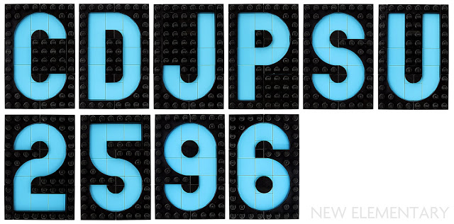
Check out this absolutely breathtaking lettering achieved by using the new “Plate, Modified 4 x 4 with Curved Cutout” part combined with the pie tiles. The design is featured in an article over at New Elementary and written by Tyler Clites and Sean Mayo. I’d love to see the whole character set. This image implies a monospace typeface but I’m guessing letters like Q, M, and W would warrant a wider footprint.
This is quite possibly one of the most impressive MOC’s I’ve seen in a long, long time.
ADVERTISEMENT

