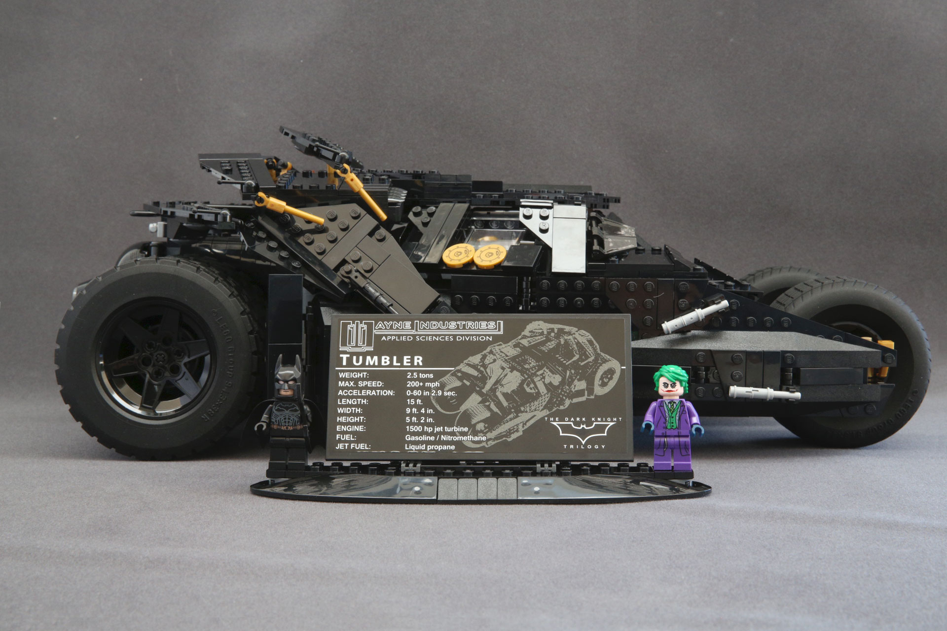
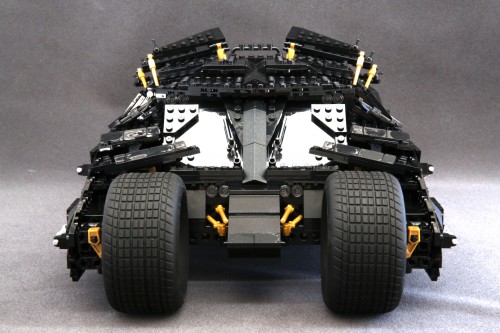
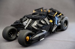
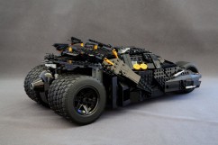
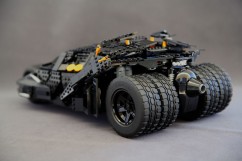
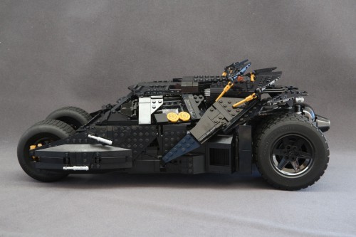
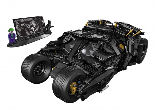
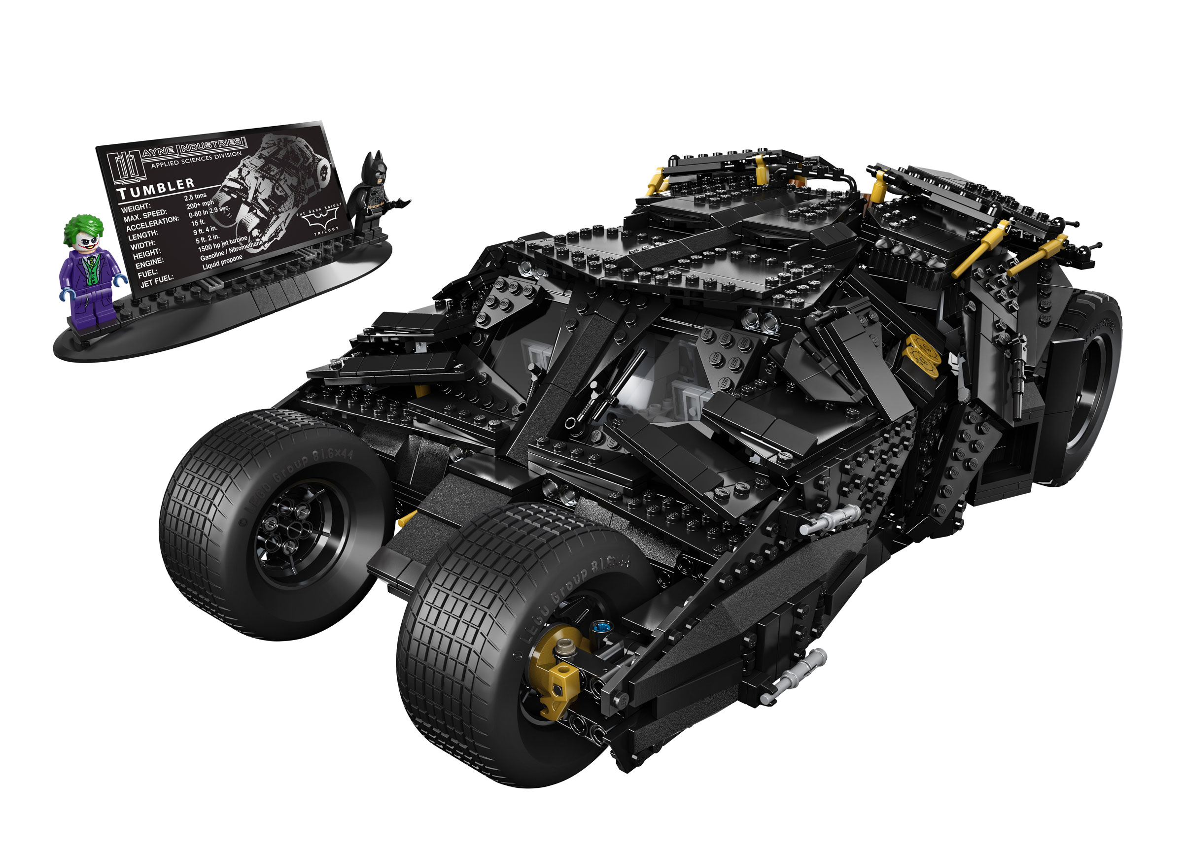
When LEGO released the first images of 76023 The Tumbler, there was a collective gasp heard from the internet. But to be honest, there was something about it that just seemed off to me and I couldn’t quite put my finger on it. After having built my review copy and staring at it for a while now I finally figured out what it is that I don’t like about it.
But before I get into, here is a breakdown of how this review is going to be done: I’ll be splitting up this review over 5 parts. Part 1 will be an analysis of the packaging of the shipping box with an in-depth interview of the DHL package carrier. Part 2 will be a review of the numbered bags along with weights and measurements of each bag. And then in part 3 will be a photo gallery of every step of the building process. Parts 4 will be the actual review. And, finally, Part 5 will be where we reveal the final score. We’ll be spreading out the review over the next 5 weeks with a post going up every Sunday evening. So buckle up and get ready for our most extensive review ever!
Just kidding. I wouldn’t waste your time like that. Our complete review is below.
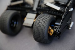
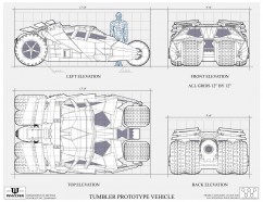
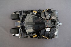
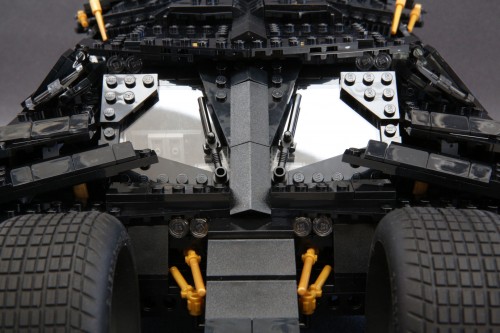
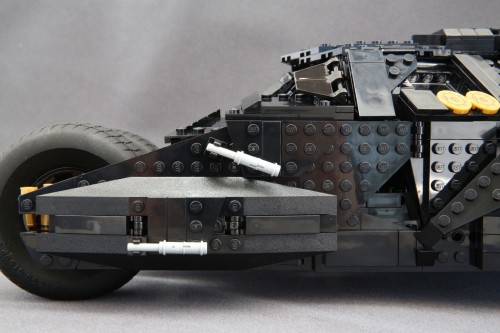
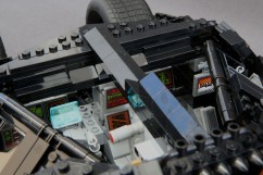
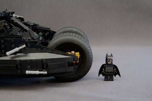
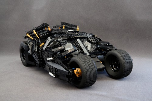
The thing that bothered me the most about this set is the entire front half of the vehicle. For one thing, the front wheels are spaced out too far apart. They should be closer together, closer to that center “nose” that’s in between the wheels. The nose is too wide as well; it should be 2 studs wide, maybe 3 studs at most but that’s it. Also, the mandible frame at the front should be pinching inward around the front wheels but it doesn’t.
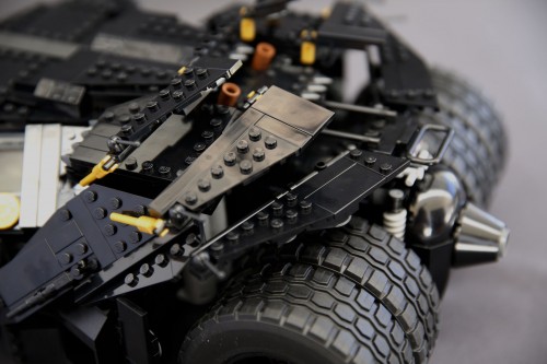
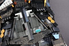
This top-down perspective should demonstrate better what I am describing. It’s just far too wide at the front.
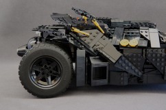
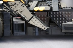
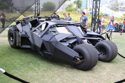
Aside from wheel placement, the paneling is all wrong in the front section which is puzzling considering how well done and spot on the paneling is on the rest of the car. From the rear quarter panels, to the rear flaps, to the roof, it all looks fantastic.
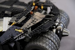
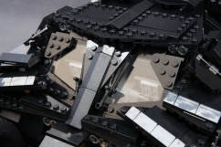
The windshield is pretty good too but that’s pretty much where I think the designer stopped trying. The angled panels surrounding the lower half of the windshield are just bizarre looking with the cheese slopes. Had there been another layer of plates and tiles behind the cheese slopes, the panels would have looked like there was a beveled edge, and that would have dramatically improved the appearance. Instead, the cheese slopes create these ridges along the leading edge that isn’t present on the real Tumbler.
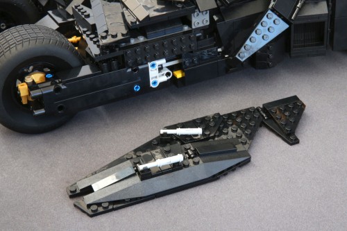
Those panels are also supposed to attach to the fender in one piece but because the fender is so poorly designed, there is no visual connection between the separate pieces. The fender uses a bunch of these Droid Fighter elements which sort of works, maybe, at the very front, on the bottom, but beyond that the element completely loses it’s functionality and resembles nothing on the vehicle. I suppose some of the individual angles are there with the underlying plate work, but as a whole the whole thing just feels lazy. I can’t help but feel the designer either got lazy or was under a deadline to finish and made some pretty big compromises to get it done on time.
Those Vulture Droid elements take up a lot of real estate leaving the designer less work to do. And it’s not like they are needed for structure or stability either because like most of the other angular panels you build for the Tumbler they just attach to the main frame without providing any needed or additional support. Like I said, the rear paneling is done extremely well, which is why the front half being done so poorly leaves me confused if anything.
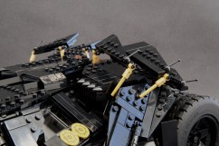
There’s a mess of pearl gold elements strewn about the model used to represent the various pistons found on the vehicle. They anchor at a single point. Yes. A. Single. Point. To be fair though, I don’t think the other end of the piston could have been anchored down without ruining the look. The top flaps are where most of these single point connections are and makes them a bit delicate to the touch. You’ll easily knock a flap or two out of place just by brushing up against it, moving it, or breathing on it wrong. Not good for those who have OCD but it’s not really a problem if you plan on never touching it again after you build it so if you’re one of those people, get your display area ready.
It doesn’t steer which is not uncommon for large scale models like this. The Volkswagen Camper Van didn’t steer, neither did the MINI Cooper, but the Tumbler is loaded with Technic elements so I was half-expecting a working steering system. There’s no suspension either. There is fake suspension in the back which is kind of ridiculous considering they could have put in real Technic suspension springs and have it look just as decent. Like the steering, the Camper Van and MINI Cooper both do not have working suspensions either but on a model that is already lacking on notable features, the Tumbler’s appeal would have greatly benefitted from having either working steering or even suspension so you can push down on it and tilt it to and fro.
There’s no Batpod which is a HUGE disappointment for me. And since the minifigures that come included with the set are based on The Dark Knight and not Batman Begins I was really hoping that 76023 The Tumbler would have it as an alt model at least. It would have blown my mind. At least, anyone wanting to take on a UCS Batpod MOC as a project will have the exact tires to use.
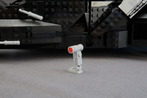
As much as I am disappointed at the lack of Batpod, it pales in comparison to the sticker sheets. I used to be much more forgiving on this point. I flip flopped my opinion of stickers from hating them to realizing that they could be used just like any other element on a variety of pieces but I’m back to hating them again. Ever since the CUUSOO/Ideas sets started having printed elements, I can’t be as forgiving. How is it that the cheap $30~$40 sets can have printed elements with limited use outside of the set and a $200 one has you applying a sticker on a 1×1 round flat tile? Yes, this button is a sticker. It was pointed out to me that even the Batman Juniors and Duplo DC Superhero sets have printed elements. So really, what gives? A premium price tag should command premium printed parts.
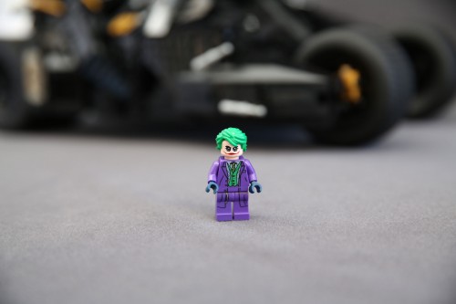
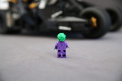
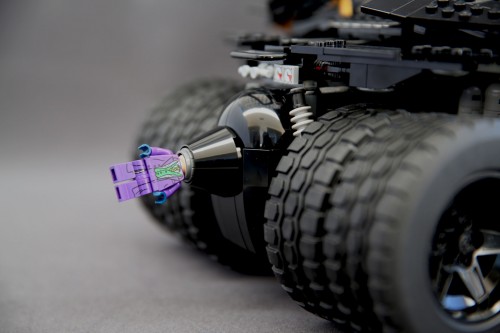
And then there are the minifigures. Honestly, they have absolutely no place in a UCS set. It sucks that LEGO keeps doing this and I wish they would stop. I love having a Heath Ledger Joker. He has a double-sided face complete with a toothy grin showing his yellow teeth on one side and despite the red smile makeup a scowl on the other. His head is flesh tone with white makeup on top. The effect is very well done if a tad on the lighter side; the white makeup part is barely noticeable on my copy but it could just be the lighting in my office as I write this. The torso and legs have printing that hits just the right balance between simple and detailed: it’s not too simple to make it look cartoonish and not too detailed to make it look complicated either.
Update: It’s been pointed out to me that Bale’s Batsuit in Batman Begins has that logo style, and also at the beginning of the Dark Knight, which is indeed correct. After knowing that, then either the suit is still the wrong one to put in this set or adding the Joker was since he wasn’t wearing that suit when they finally meet. My overall opinion hasn’t changed much though on this point though, because it’s still a messy-looking batsuit.
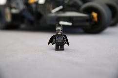
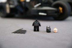
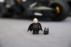
Batman on the other hand leaves a lot to be desired. First of all, the logo is all wrong. Nowhere in the Dark Knight trilogy does his bat suit ever have a logo like that. Thankfully, that other Tumbler set has a torso with the correct logo should you want to switch. Secondly, he suffers from the too-much-detail affliction. His torso has so many lines on it outside the logo that you have no idea what they are supposed to represent and it just ends up looking way too busy. And thirdly, he has a double sided head but there is very little difference between the two. They also stuck with the white pupils even though his actual pupils are seen through the mask (except for when the cell phone sonar field is active) in the Dark Knight movies. He is unique to this set so it’s not all bad, another bat suit to add to the collection, but if you’re not into that he is hardly a reason to justify getting this set. So really, out of the two figures, only one is really worth getting.
Despite my griping it is a wonderful looking model for sure at certain angles. And for a lot of customers, that’s all that really matters. All the issues I brought up won’t even register on their radar. If you’re a fan of Batman’s Tumbler from Christopher Nolan’s Batman trilogy, then you need to get this. It is a near perfect model of the Tumbler, as perfect as it can get when made from LEGO elements. If we allowed half star ratings, it would easily be a 4.5 out of 5 stars but we roll with whole numbers around here and unfortunately there’s too many flaws that prevent it from getting a perfect score, so down to 4 it goes.
People will probably think I’m crazy for not giving it a 5 but I’m hard to please and I can’t honestly say this model is perfect. Don’t get me wrong, it’s a great model and despite my complaining there’s really no reason not to get this set other than its spendy price tag or you’re not a fan of Batman and/or the Tumbler model in general. It’s awesome and if you pull the trigger, you won’t be disappointed.
Supposedly the set was supposed to go on sale last night at 9:00pm Pacific for the VIP Early Access that starts on Monday August 18th, but it didn’t go on sale, at least not for North America. Hopefully though, by the time you read this, you’ll be able to to purchase 76023 The Tumbler is now available from LEGO Shop@Home. You’ll need to be logged into your VIP account to access the link below if you are attempting to click on it before September 1:

