
The LEGO Groups sent out the above message to affiliates yesterday warning us giving us the heads up for a new website experience at www.lego.com. The site is now split between two very distinct section: one for adults and one for kids.
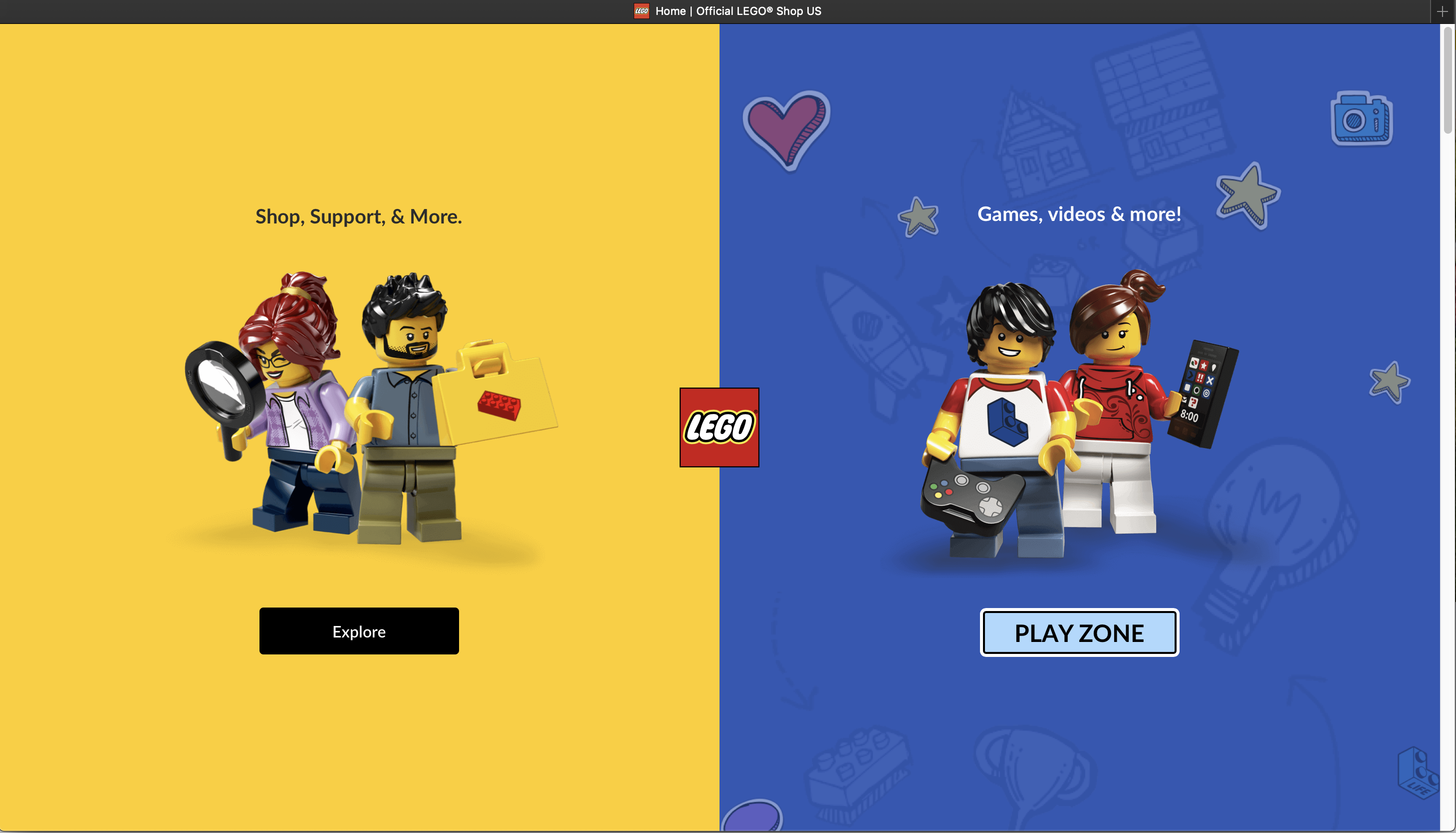
The adult side takes you immediately to the old shop.lego.com site but under a new URL structure. Everything else looks the same. Bookmarks should forward you to the new updated address to minimize any friction or confusion. You can still browse themes and shop and search like you used to.
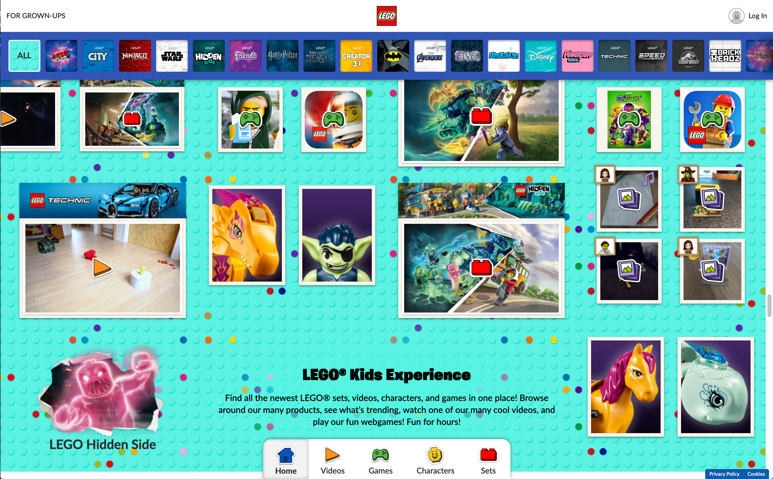
The kid side, labeled as “Play Zone”, is, I assume, all new. I haven’t spent a lot of time on that side of the fence before. This new experience feels very Pinterest though. Masonry-style sections for each theme in a ginormous grid will have you scrolling up and down AND left and right for days. You can also just pick a theme from the thumbnail bar and jump directly to that section. I hope you have a fast internet connection though because the lazy-loading of images will make you think sections are blank or empty until images start popping in. Can’t say that I’m a fan of the UI, but then again I’m not the target audience for that side anyway, so maybe kids will enjoy it?
Clicking around, however, I immediately spotted a few bugs that should not have passed QA. And if they were flagged and LEGO decided to ignore it, then shame on them. For instance, if you’re on the kid side and click on “For Grown-ups”, you’re not taking to the shop side, you’re taken to the default home page where it asks you which side you want to go to. I would think by clicking on “For Grown-ups” it’s pretty clear which way I’m going.
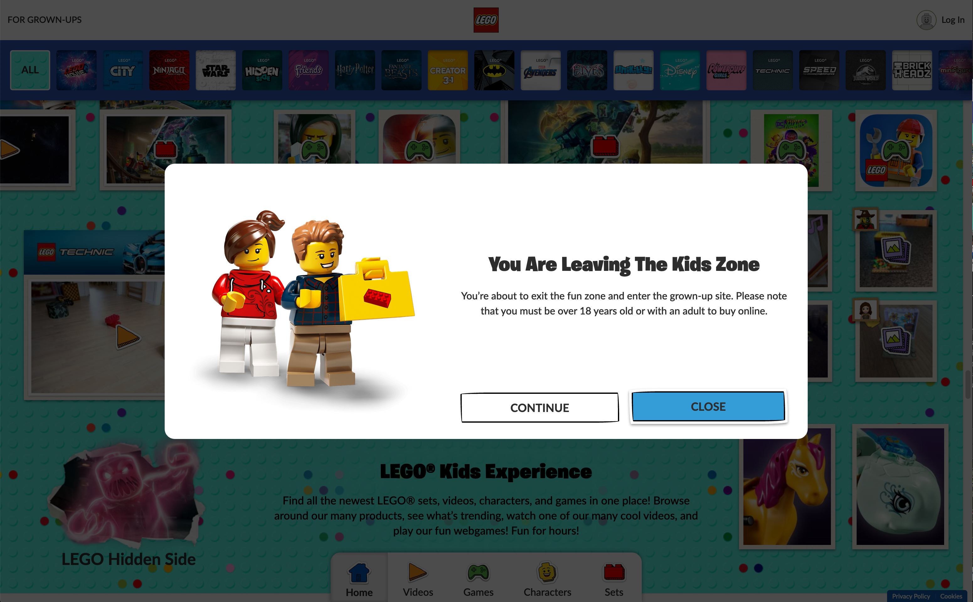
Also, you can just forget about accessibility. When that pop-up comes up, even though the “close” button is highlighted, hitting enter on your keyboard or pressing the space bar does absolutely nothing. Tabbing doesn’t highlight what you think it would highlight. And escape doesn’t even close the pop-up. The focus is still somewhere behind the popup. Keyboard navigation just doesn’t exist on this site.
Also, when that pop up first loads, why does it take a half second before the words “Continue” and “Close” appear?
Strictly speaking from a technical side, I’m curious what the page weight and load times are now compared to the old site. I can’t help but think of this article on Pixel Envy (fair warning: the article I’m referencing uses language not appropriate for younger readers. Still interested in reading? Then click on this. It’s a great article) and wonder if a trade off on style and wow-factor vs. bandwidth and load times is ever considered. Making something better can sometimes make other things worse.
Not that I need to but I want to highlight a prime example of that last sentence: Shop@Home’s VIP rewards. It took a simple streamlined workflow of redeeming points and turned it into a convoluted process while offering rewards nobody asked for as a distraction and justification for changing things. Also, I recently went through an annoying experience placing an order and typed out the whole thing here but decided to cut it out because it doesn’t belong.
I was ready to delete this post, chalking up my initial rant on hunger. But after having a nice lunch and sitting here with a belly full of food, my comments and initial reaction still stand. I asked Nick to talk me down off a ledge, but he had his own thoughts. So I decided to keep the article. And here they are:
Nick’s Take on the new LEGO.com
Before I jump into tearing the site apart in ways that it so richly deserves, I’m going to provide a little background about myself. I’ve put little tidbits about myself in articles before, but my professional career is based around enterprise web development. Specifically, it’s around user experience, the idea that the best applications and sites are the ones that both make sense and are easy to use.
I’ve worked in this field for a long time, both doing some design and research and working with people who do those things far better and for a living. I’m not trying to brag, but I like to think that I am damn good at my job, and have built enough sites and apps to know some of the things that work and the things that don’t.
So, when I say that this is a trainwreck of a website, I want to make it clear that I’m not just going on one of my usual salty rants, but going on a salty rant that’s driven by some practical experience building sites that don’t do this. I’ve spent a lot of hours in a lot of meetings explaining why you don’t do things like what LEGO has done here.
I was on the site for maybe 30 minutes, and I could probably build a case study on some of the things wrong. Like the fact that they disabled use of gestures, swipes, or keyboard shortcuts to navigate backwards or forward (you can only use the browser buttons or their arrow). Multiple broken links when you try to get to content that just drops you at the landing page. No structure to content navigation. No prompts on where or what to go.
Since LEGO is ostensibly targeting kids with this redesign, I opened this up on my iPad and my iPhone to see what it was like. My daughter may love to hop on a computer to play a game, but she doesn’t really browse the internet (and thank goodness for that). She understands apps and has been able to navigate around a tablet since before she could walk, though, and I would hope that LEGO would have built their site towards that…
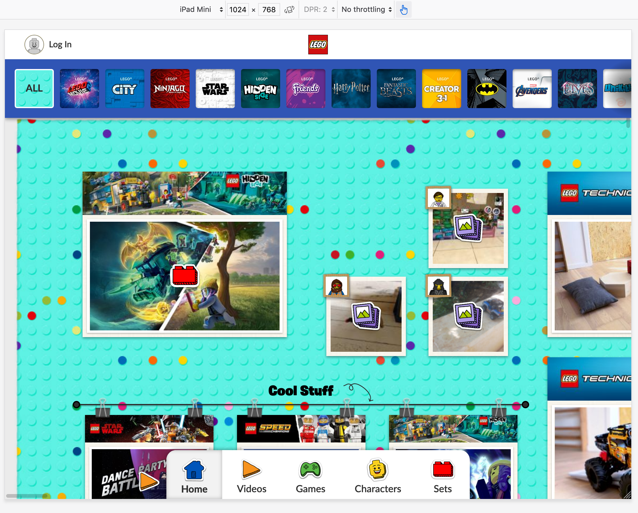
Oh, yeah, clearly not a tablet design. It’s clipping the screen on the initial load in and blocking the call to action text. I’m sure those videos are important and all, and the menu that also sort of serves as a legend for what the icons mean… but it’s entirely without context. What’s really weird is that clearly the UI was built around some touch interactions, given that the navigation goes on both axes.
The fundamental problem with the “play” site is there’s no purpose or flow to it. Why did someone come here? What are they looking for? Kids do browse around, but they still have reasons to visit a site to begin with, even if it’s as simple as looking at the products or finding their favorite theme or cartoon. You have to be able to answer that question, and then focus your efforts on making your provide for that.
This has all the smackings of a site that was designed around a look, and not a purpose. I will absolutely guarantee you that at some point, someone came to a designer (or worse, a developer), and said the phrase “we need to make this pop.” Words like “slick” or “shiny” were certainly used. And most likely, there was a committee approach of people who put things together and would not give on any of it.
There are many fundamental ideas in user experience, but one of the fundamental things to understand is the user journey in relationship to a product, brand, or feature. LEGO wants to sell kids (or more aptly, get their parents to buy sets for the kids) sets. How does that relate to the brand and website? What is the pathway that a user, any user, is going to take through the site? It’s based on their persona, and there are plenty of ways to wrap a persona or ideal around a kid using a webpage… but none of that seems to have been done here.
I don’t know if this site was built as some echo of another site like Instagram (do younger kids even care about Instagram), or YouTube (I know they care about this)(ace: I’ll bet my hat it was Pinterest), or something else. If it was built by anyone, I’d say a bunch of marketing and product owners who all wanted their stuff to be displayed and available, and what they wanted to show, rather than trying to figure out what customers want. Because I’ve seen that happen so many times in other projects I’ve worked on or at companies I’ve worked for. Fun aside, it always, absolutely always, includes a product owner saying something along the lines of “I know what our customers want, I can provide the requirements.”
One thing that I would add, though, in a more positive tone… I took a look at some of the code on the app because I was curious if this thing suddenly ballooned to be gigantic with all the extra media and libraries. I was pleasantly surprised by what I found; the developers who worked on this clearly did some optimization work to keep build sizes down. I can relate to that position, to have to deliver in spite of designs and requirements that are contradictory. I bet that the team busted their butts to get this done, and they deserve some recognition for that.
That being said… LEGO, if you’re reading this… I am available to consult. 😉


You must log in to post a comment.