
As I was going through inventory this weekend, I ran across a couple of sets that made me pause and appreciate the design aesthetic of the overall packaging. And there was one in particular that made me literally laugh out loud at just how terrible it is, so much so that I felt like I had to write about it.
The Best
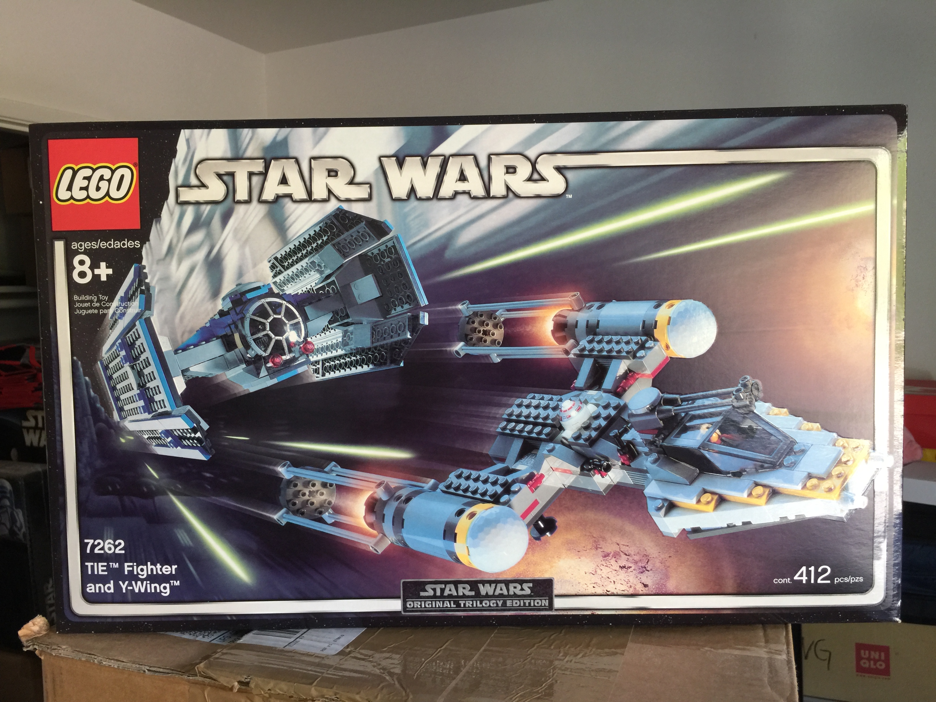
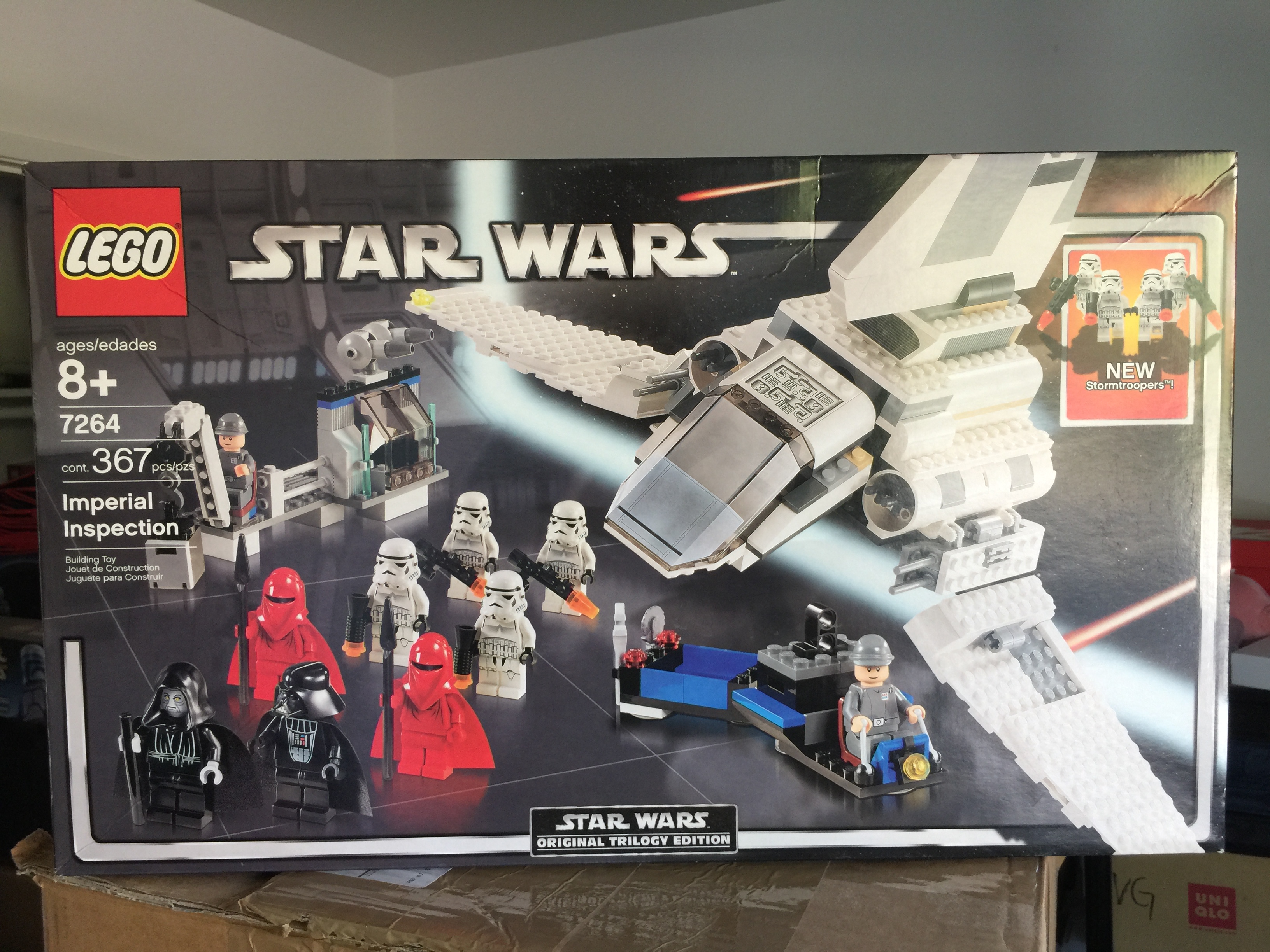
We’ll start with the best, obviously, and the best is the Original Trilogy Edition packaging. It is just hands down the best design that’s ever graced a LEGO Star Wars set. This was circa 2004 and came in the middle of a product cycle. So that year you could find two of the same set with different designs. I realize that the branding of Star Wars licensed product is controlled by Lucafilm Licensing, so there isn’t a lot of leeway as to what LEGO can do. That being said, some designs are better than others, and the Original Trilogy edition packaging was the best. The black and silver border works really well with the rectangular box and frames the action shot very nicely. I mean look at 7264 Imperial Inspection:
Blue packaging was the original design for sets that year before the OT Editions came out. Here’s a comparison between OT and blue packaging using 4500 Rebel Snowspeeder:
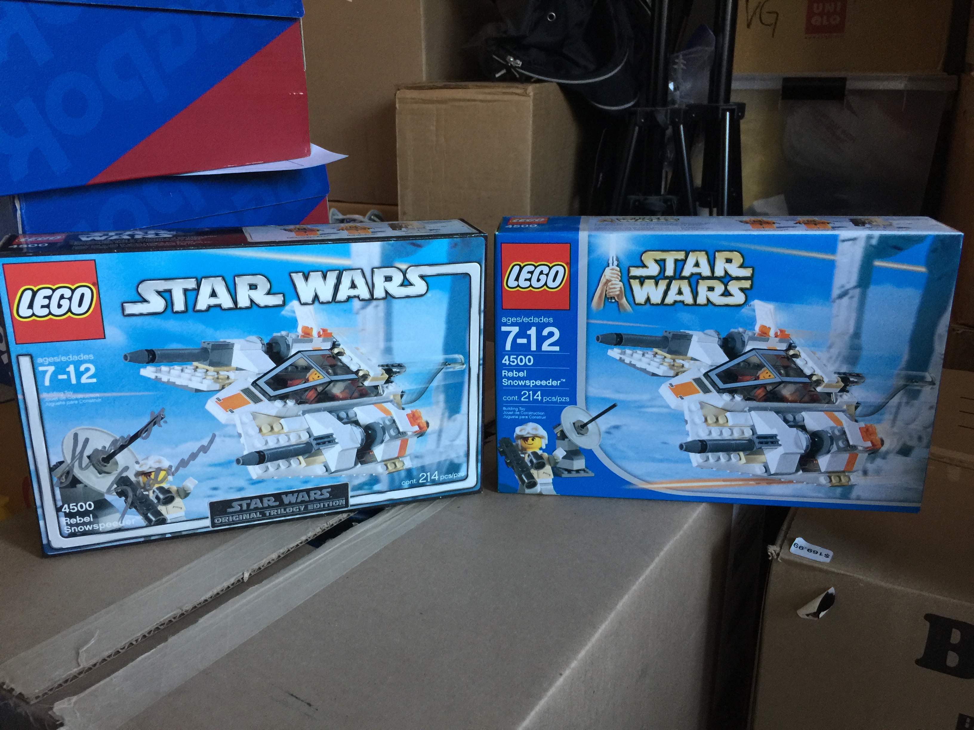
While I was doing inventory and getting Bricklink low prices on my junk, I noticed that the Blue packaging versions were asking for higher prices than the OT counterparts which is just crazy to me.
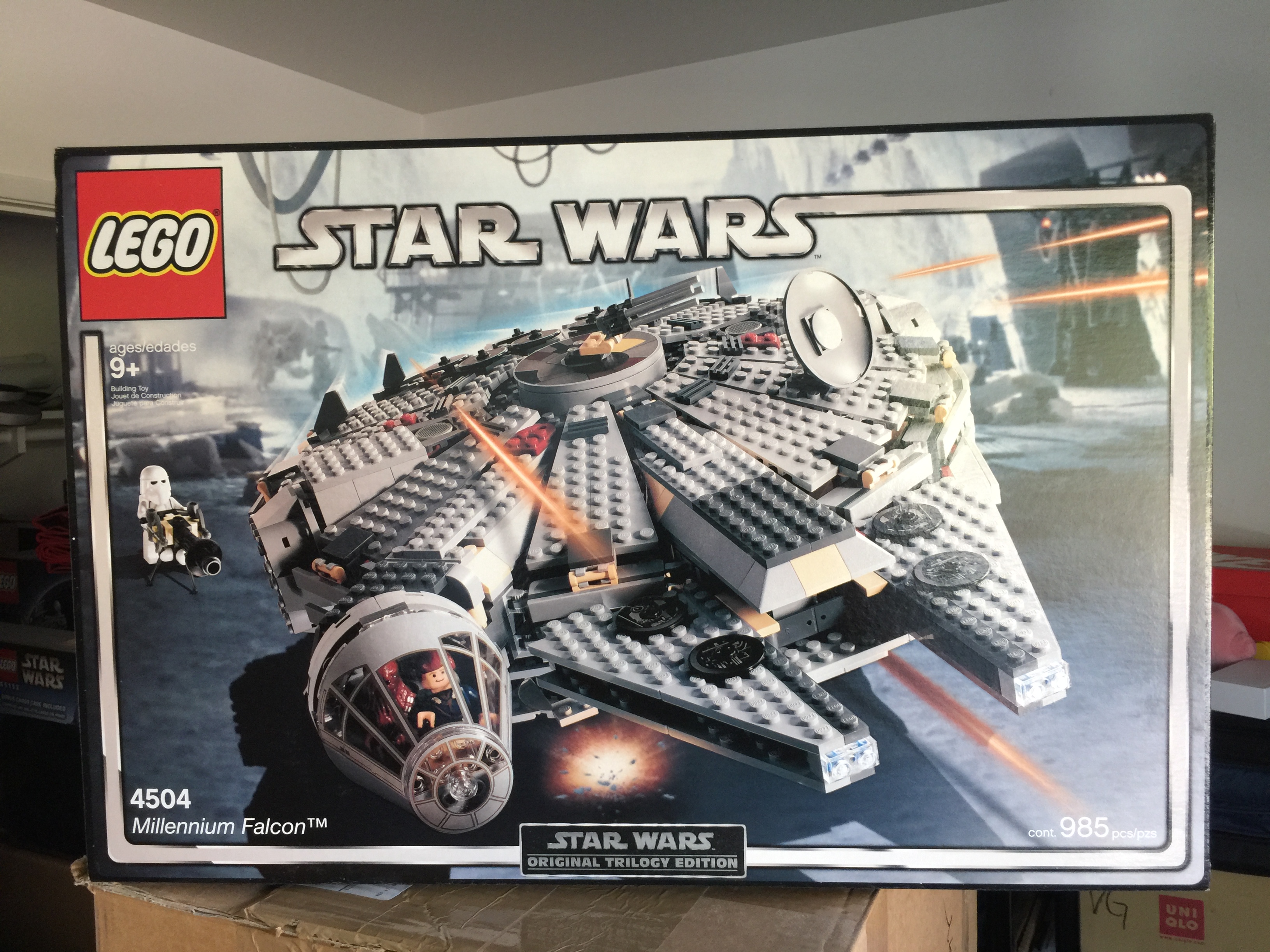
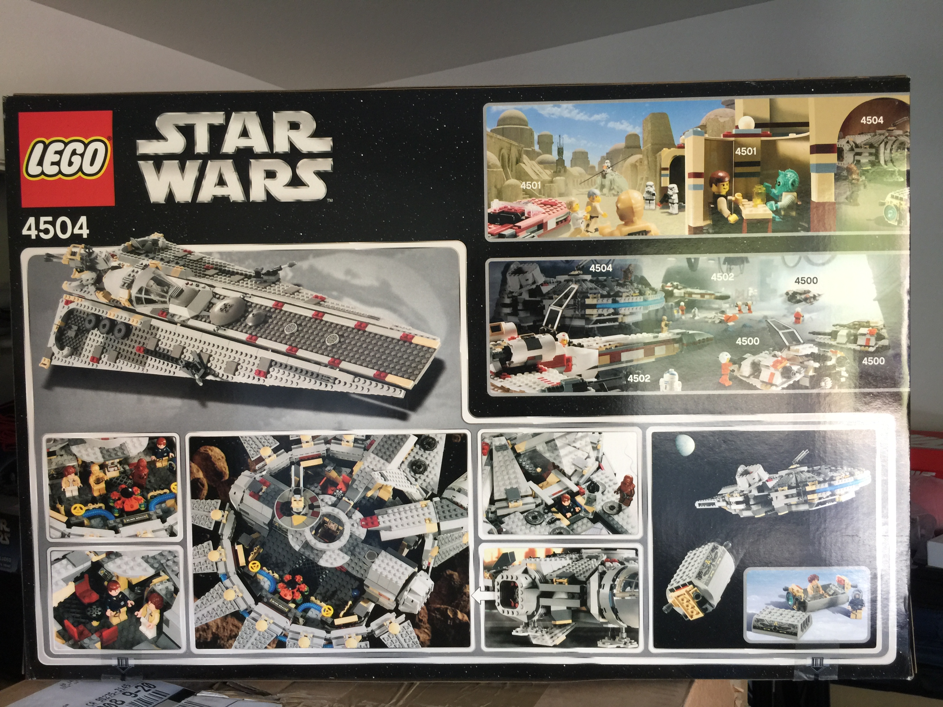
Out of all of the OT branded sets, the best one is this one, 4504 Millennium Falcon:
It had a flip-top cover that harkens back to the sets from the 80’s and 90’s. While there were no plastic windows to highlight specific parts like those old sets did, it did highlight a lot of the play features:
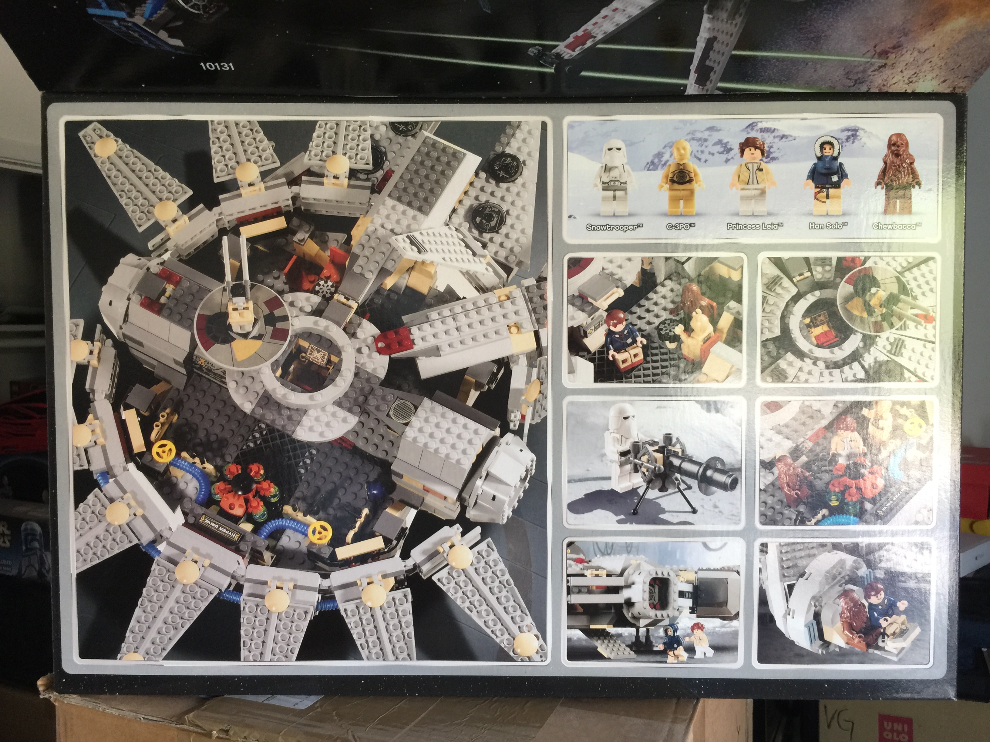 And the inside of the flip top showed off some more product:
 Looks so nice.
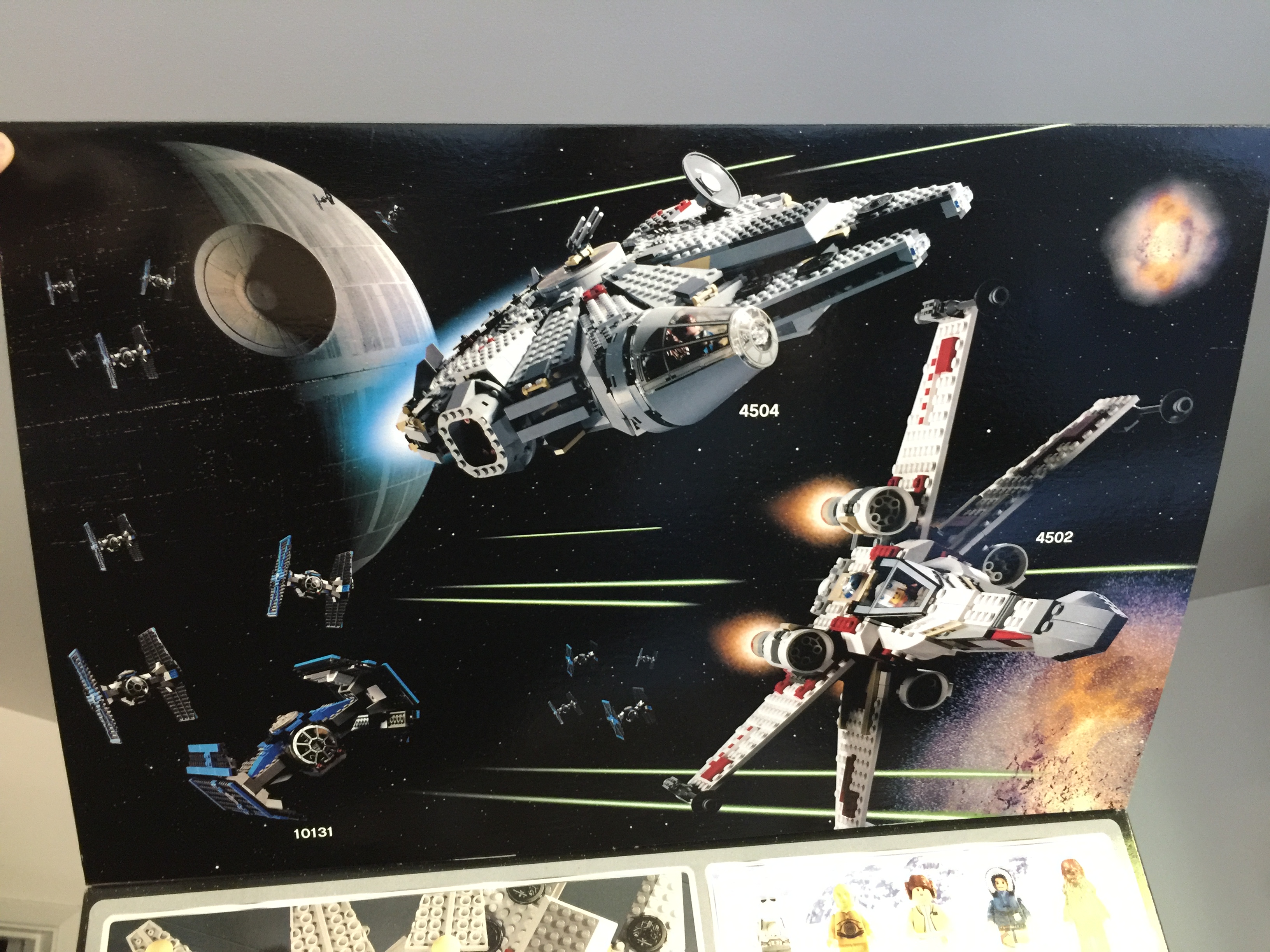
And the back showed an alternate model!
This was one of the best things of retro LEGO sets. Showing the possible models that can be made from using the same pieces that’s inside the box you’re holding does more to spark imagination, ingenuity, creativity, and problem-solving than anything else LEGO ever put on a box. Those alternate models were windows into worlds of possibility. You just don’t get that anymore. “Wow, I can build that?” and “How did they build that back part?” or “How is that piece connected?” aren’t things you say anymore when looking at the back of a box because there is an instruction sheet for everything you can build on the box, which is only the main model. I understand alternate models for sets these days is a rare occurrence, like finding a Shiny Jangmo-o, due to budget, but I do wish it happened more frequently.
The Second Best
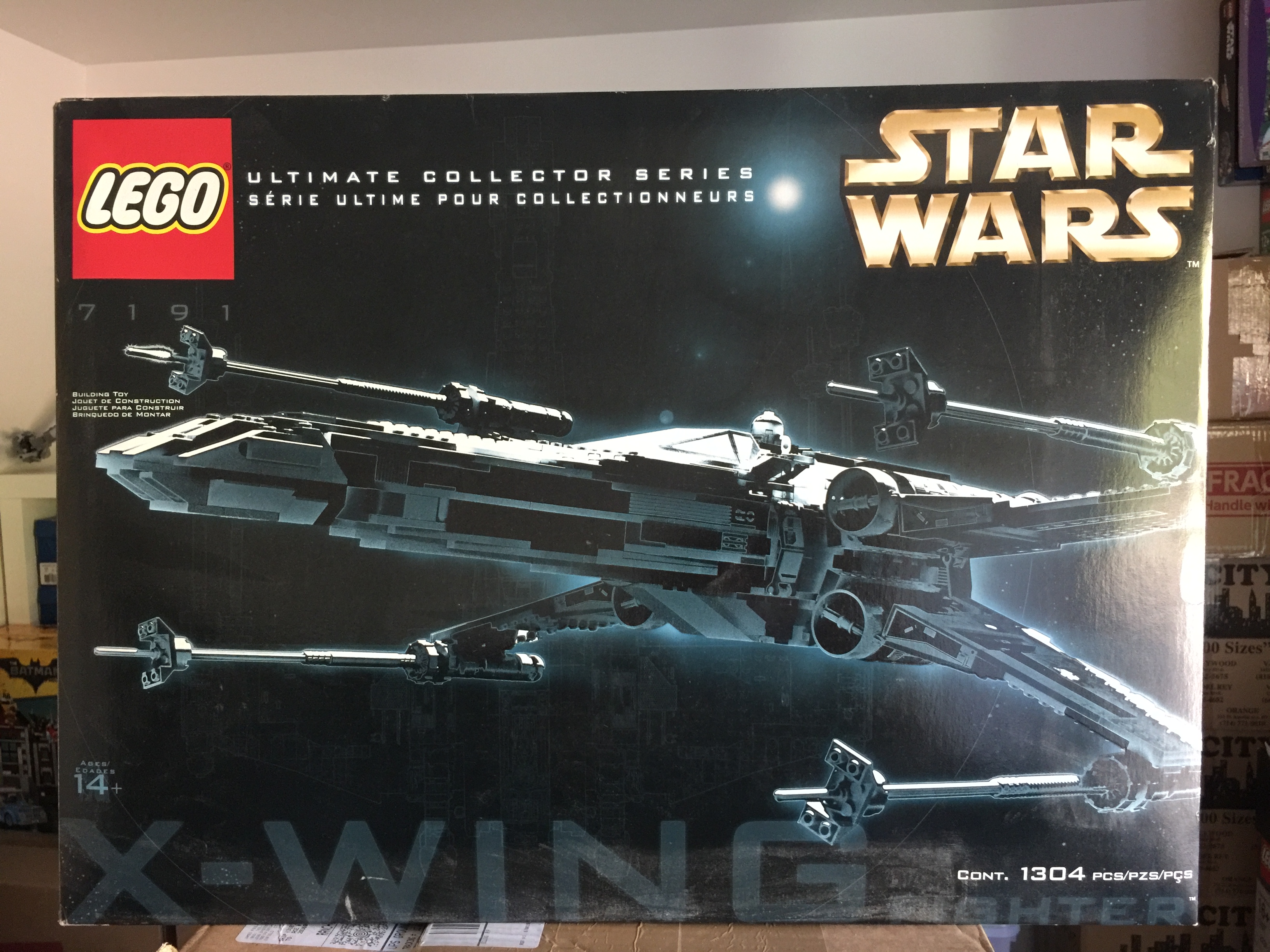
The original Ultimate Collector Series packaging gets an honorable mention, both 7191 X-wing Fighter and 7181 TIE Interceptor. At the time I laid eyes on it, it was so far and so different from every other LEGO set that was sitting on the shelf. The black boxes, the font treatment, the monochromatic model on the front. And it wasn’t a black and white picture of the model, it was more of a silver/gray finish. Dare I say there was a certain level of elegance and posh to this set that set it apart from any other LEGO set before it, and even after. If the sense of scale wasn’t enough of an indication, the box design definitely communicated that these weren’t meant for your average kid. It’s still gorgeous to look at to this day.
The Worst
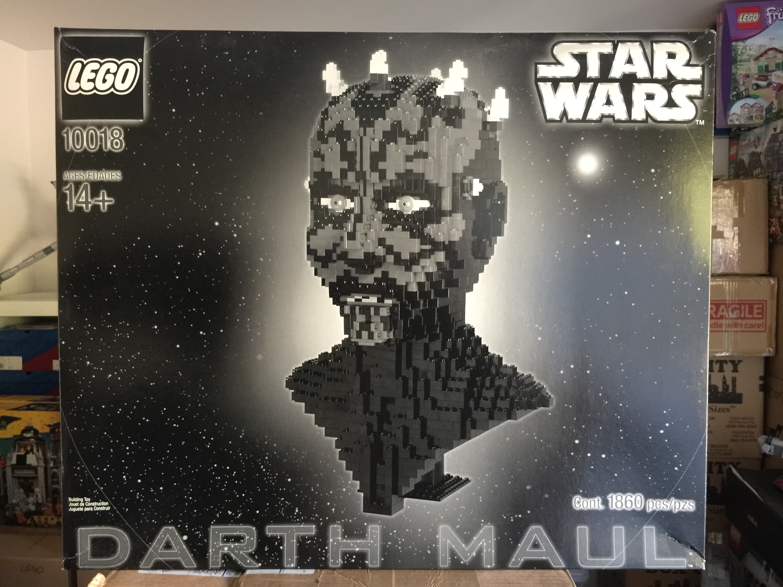 10018 Darth Maul is just the WORST. The black and white box does absolutely nothing to show off the colorful nature of Maul’s bust. The red tatoos, the yellow eyes. All lost to grayscale, and it’s not even a bust of Jorah Mormont. Even the LEGO logo is muted which is a really odd decision from a branding perspective. And the back? This is where I guffawed out loud:
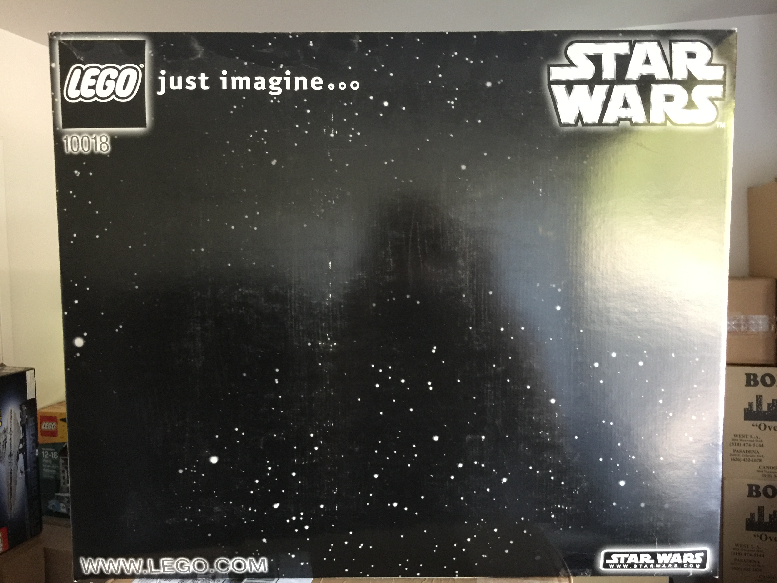
Just imagine…. space? There are words there to inspire you, “just imaging…” and that’s it. This is a hugely missed opportunity to show alternate models that can be made with the pieces in the box, the way LEGO used to do way back in the day. Or highlight some features of the model in call out boxes. Something, anything but a blank space field would have been better.
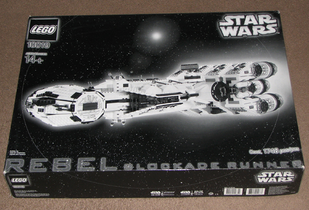
Now, to be fair, if I am remembering things correctly, Darth Maul wasn’t the only set to get this black and white, uninspired design. There were other sets released around the same year that had a black and white box: 3450 Statue of Liberty, 3723 Minifigure, and the UCS Tantive IV, 10019 Rebel Blockade Runner. The justification was that these sets were targeted to the adult market in the Direct 2 Consumer product line which was still in its infancy at the time. Also, because 10018 Darth Maul and 10019 Rebel Blockade Runner were never intended to reach retail shelves, that may have given them an exemption on product branding requirements that Lucasfilm Licensing establishes for their licensees to follow.
The Tantive IV set eventually got a retail releases at Target stores, and the box was colorized and improved upon to match the look and feel of other sets released during the same year:
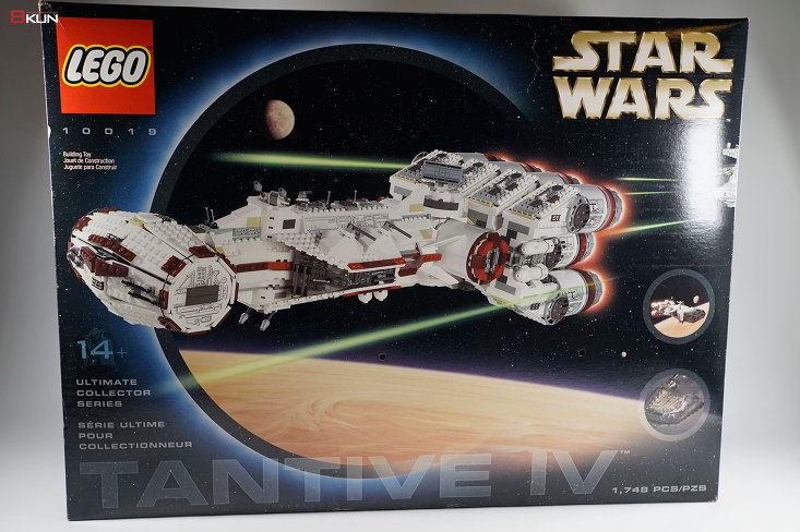
They even updated the back:
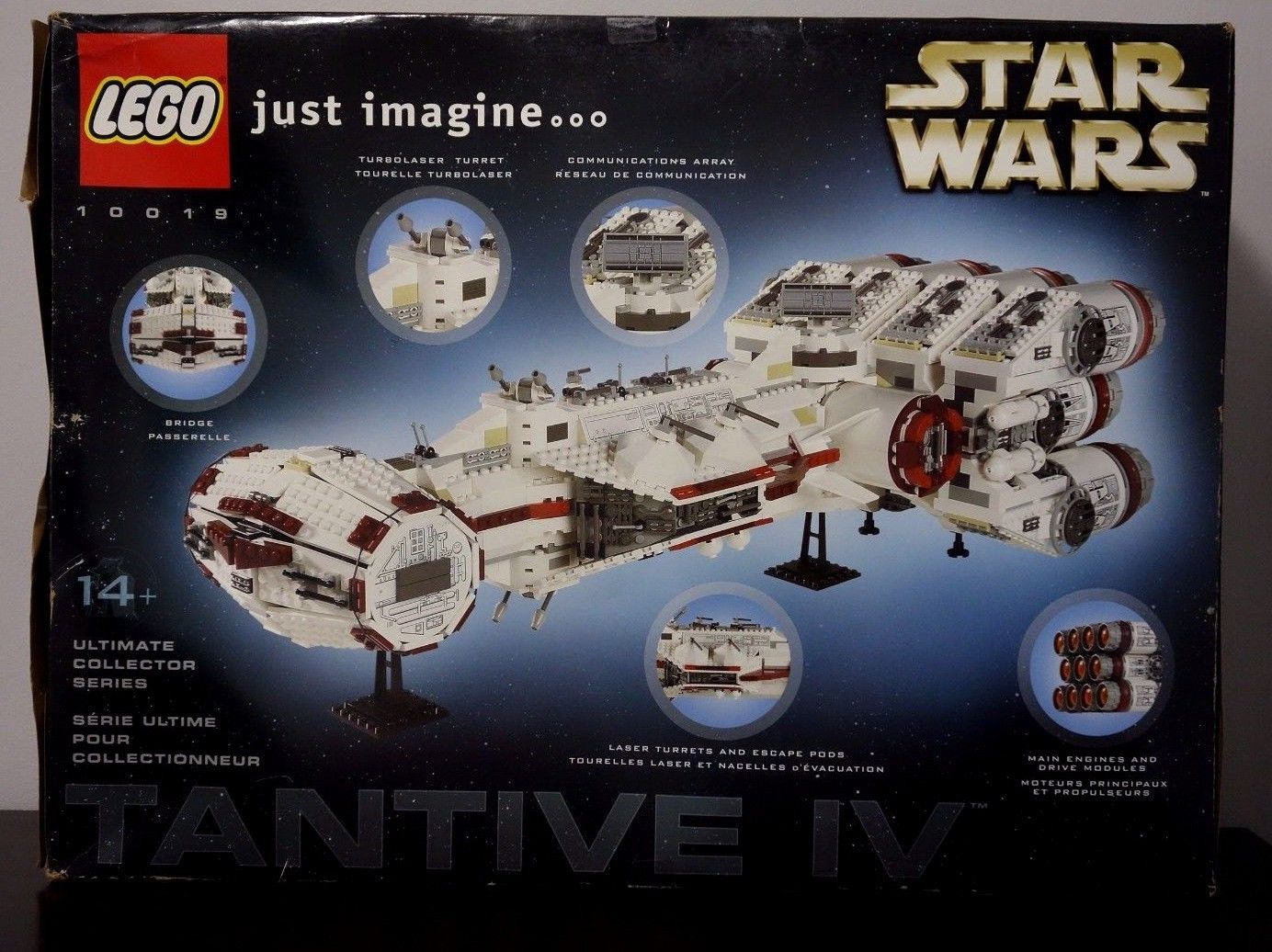
TONS better, right? They kept the “just imagine…” call to action but included highlights of the model with rich, colorful photos. SO much better.
But the Darth Maul bust wasn’t so lucky and never got a colorized box. And if it did, I completely missed it and is unfindable even with Google. Luckily for us, LEGO has never gone back to a black and white package design and thank God for that. So 10018 Darth Maul will probably be the King of Bad Design for years to come. They might make case studies on this one for design schools on what not to do.

